2015
Renata's Drops - Laura Vinci
Galeria Pilar
In a recent newspaper article about Renata Tassinari’s exhibition at the Instituto Tomie Ohtake the artist made the following comment: "I want my paintings to have the joy of color of Matisse’s canvases, as I really consider myself a colorist." I suppose that many artists would like their work to be somehow related to Matisse: the elegance, the frankness, the beauty, the purity, the genius. Renata chose the joy. And she herself is a colorist. And a very particular colorist, because she has the uncanny ability to treat her palette as if it were made up entirely of pure colors. Even when mixed with white or black, which would reduce their intensity, the colors continue to pulse as if pure. Even when she uses gray. This is an intriguing aspect of her painting, one not in agreement with color theory manuals.
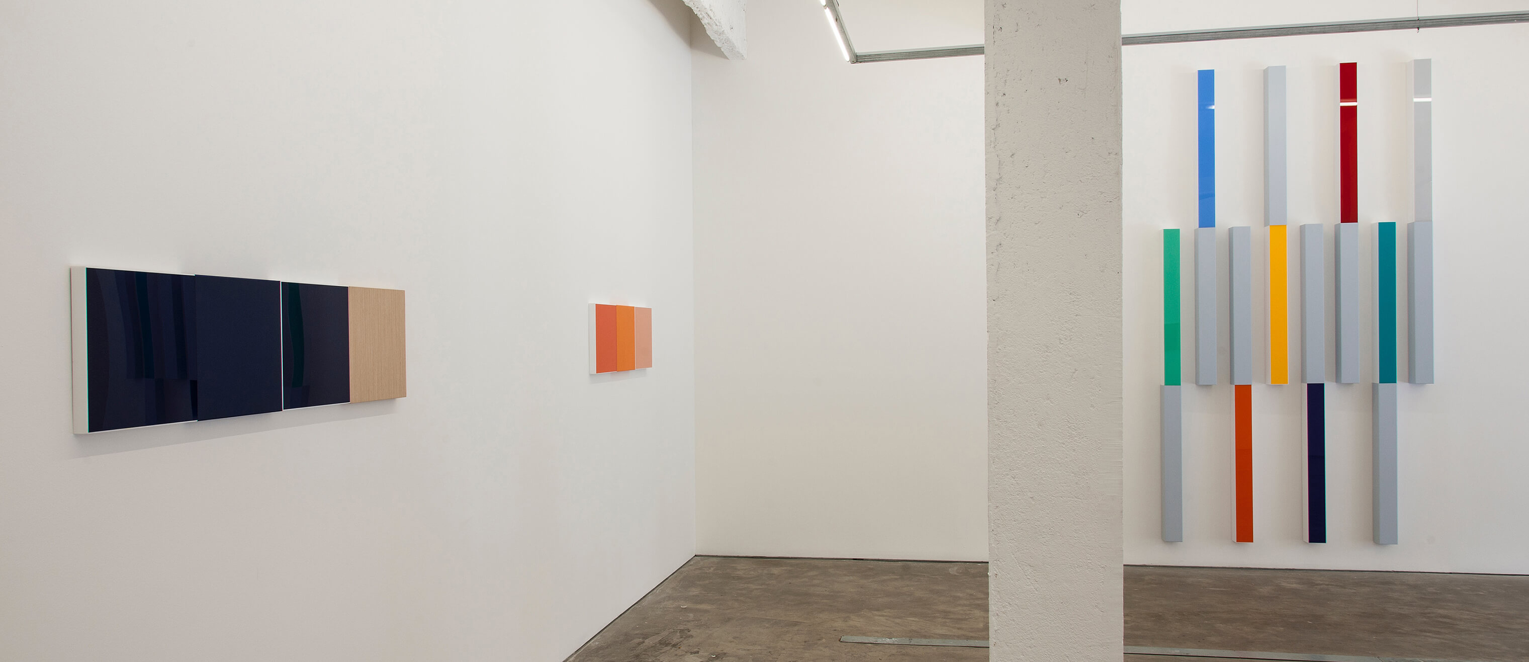
When looking at a painting of hers, any painting – let’s say the one that has two powerful orange squares side by side, one matte, one shiny, next to a wine-colored square and a wood laminate square –, I wonder what makes the picture remain whole. In theory, each color square is vibrating at a different frequency, and this should generate an uncomfortable sense of the entire, but that is not the case; quite the contrary, we experience a deep sense of everything serenely in place. Does this unity exist because the colors are painted on separate parts? Each color has its square, always. Like little colored squares in watercolor sets or Dulcora drops, each color in its cellophane wrapping (TN: Dulcora is a brand of square-shaped Brazilian hard candy available in different fruit flavors).
Even when the squares are slightly different: when color is inside an acrylic frame, showing the white border (for me a profound statement of admiration for the work of Mira Schendel), slightly decreasing the size of the colored square; or when color lies behind the shiny surface of the acrylic; or even when color is matte over acrylic; and, even, when the square is cut from a sheet of wood.
Why does all of this, together, appear as one?
Looking at some relatively recent, more vertically oriented works, like the two different blues separated by whites, where the color areas also have different sizes, this unity persists. So my thesis – that the unity results from separating the colors into equal square pieces, even if slightly different –, is not borne out.
But this new work revealed to me the secret behind the unity. The delicate white skin of oil paint applied to the acrylic, enveloping the entire frame, is what made, for me, everything become one. It is this strange skin of color that makes a painting made up of parts become a single body. In all of them I am reminded of that very thin film that forms on Maizena cream (cornstarch), very matte, contrasting with the soft and shiny under layer, which used to be prepared by our mothers when something was not right in either spirit or body. The comparison may seem mundane and overly domestic, but it was this image that made me understand that the works of Renata Tassinari inhabit a place of tranquility in the world, where the greatest differences coexist peacefully. Perhaps it is not the joy of Matisse, but it is certainly a pacified and happy place.