2009
Colors and the Dilemmas of Experience - Rodrigo Naves
Lurixs Arte Contemporânea e Studio Buck
In a statement from 1943, Matisse declared: "I feel through color, so it is always through it that I organize my canvas. But the sensations should be concentrated and the means used taken to their maximum expression." One could expect nothing else from one of the greatest colorists of all time. And it is enough to look at Red Studio (1911) to become convinced that, in fact, Matisse appeared to have such a close relationship to the world that the contours and limits of reality appeared on the verge of dissolving into the colored matter that gave it body and authenticity. But the painter always made it clear that this generous sentiment towards life would be of little use without the means of expression that make it a work of art, thus allowing it to be shared by other men and women. As the English critic Clive Bell wrote, "No one ever felt for the visible universe just what Matisse feels; or, if one did, he could not create an equivalent."
The intensity of color in Matisse's paintings reveals a sureness with respect to sensible reality and, above all, with respect to the possibility of establishing connections in which individuals and the world configure each other simultaneously, without violence or submission. And his canvases are the best example of this possibility. Certainly, this affirmative stance towards the world is not characteristic of all modern painting. The German Expressionists, profoundly influenced by Matisse, gave his colors an almost contrary meaning, in which color suggests stridency, and conflict between individuals and the reality that has been given them to live.
Be that as it may — affirmative or conflicted —, it seems to me beyond dispute that nearly all modern movements for which color was important employed it as a means of access to the world, even when threatening. With Andy Warhol, colors acquire new meaning. They hover phantasmagorically over the high contrast silhouettes obtained from photographs — of Marilyn Monroe, of Elvis Presley, of a race-related incident, etc. —, without adhering to them. The matter of the world no longer seems to attain a determined way of showing itself. And from this fission between colors and things a shifty reality emerges, one in which affirmation is insistently elusive.
Renata Tassinari's painting developed during a period of change in the status of color and reality in contemporary art. And I see her trajectory as representative of transformations that led the sensible world into an ambiguous and changeable position. In one of the first exhibitions in which all trace of representation is absent — in 1993, at Galeria André Millan —, she tried to retain a residue of matter in her colors by placing sheets of paper between them and the canvases and by thickening the paint with wax. The result had a dubious intensity because the materiality of the paints and the papers, instead of accentuating the vivacity of the colors, generated an excessive presence that hindered their apprehension and threatened to relegate the colors to a secondary plane. Materials and colors changed places incessantly, leaving the spectator incapable of attaching himself to one or the other.
Two years later, in the same gallery, her paintings dispensed with this membrane that intruded between color and canvas. However, the handiwork involved in each area of color as well, as the relationship between them, deepened that dissociation between color and its appearance that characterized the earlier series, as if the separation between color and matter were intrinsic to the very manner in which her colors emerged. Some areas of color — the browns, earth, graphite, etc. — were strengthened by using encaustic, and the more massive presence made possible by the wax seemed to return them to the mineral world to which we associate them. But, by conferring a similar density to blue — a tone that is generally associated to the representation of the atmosphere, air, and sky —, the artist contested the mimetic interplay between colors and materiality that had previously oriented her. And, so, blues, browns, earths and graphites, all went back to being just colors, if one can still use that word for luminosities that aspired to a paradoxical and disquieting corporeal resistance.
In Brice Marden's encaustics one could also identify a similar dilemma. Working with color areas more translucent than Renata Tassinari's, the American painter gave back to color a condition in which, apparently, its status as a phenomenon, as an event taking place before our eyes, reacquired intensity. Like in the velature tradition, colors appeared to follow the movement of light that penetrated their wax surfaces, reentering our eyes after a round trip that restored their density and experience. Concurrently, the quasi-tonalism of many of these paintings— that is, the proximity of the tones of their color bands — attenuated this impulse to constitute the world, since tonal proximity between different areas of a picture redirects perception towards the observation of interplay between different parts of the pictures, since tonalism reduces the autonomy of each band by making them complement each other reciprocally.
For Brice Marden and Renata Tassinari — and similar issues could be raised with respect to several other contemporary painters, like Agnes Martin, Sean Scully, Jessica Stockholder, Cássio Michalany, Sérgio Sister, Paulo Pasta, Fábio Miguez, José Bernnô, among others —, contemporary reality involves practices that inhibit a strong experience of its events. And, for this reason, colors should acquire a meaning different from the one that guided modern art. The reflexivity of Matisse's color lay in the question, posed through the colors themselves, concerning the best way for a blue or a red to show itself and, thus, provide an emancipatory experience of things that showed themselves without embarrassments or anxieties. This question has shifted for much of the best contemporary painting, beginning to sow doubt into the ability of colors to provide an experience of reality.
In her 1998 exhibition at Valú Ória Galeria de Arte, Renata seems to make an effort to overcome this severed condition of contemporary perception, attempting to reintroduce a more affirmative and sensorial character into her painting. Colors are no longer applied impersonally and confined to rigorously enclosed areas, and a subtle, somewhat Morandian gestuality attempts to reunite making and color, activity and experience. With that in mind, the artist had also stopped using encaustic, and the more immediate presence engendered by oil led one to believe that her doubts had brought about some certainties.
The artist, however, did not find this direction convincing. And, in 2002, at Galeria Baró Senna, Renata appears to make a radical attempt, simultaneously joyful and distressed, to endow her colors with positivity and affirmative power. Back are the flat colors and precisely delimited areas, and areas of highly contrasting colors coexist with almost opposite areas of similar tones. If, on one hand, the proximity of intense and belligerent colors paid tribute to the autonomy and sovereignty of certain experiences, the gentler tonal passages served to remind us that, in the sensible world, there are no absolute criteria or univocal definitions, and we cannot go far without standards of reference. And, once again, the elements within a work cast doubt on the possibility of a unity that could provide a strong experience of things and their situations.
Outlined thus, somewhat schematically, the direction of Renata Tassinari's painting might suggest constant oscillation between almost opposite notions of color. But, for those who follow her work process more closely, what stands out is her loyalty to the problems and inquiries raised by the adventure itself. However, the importance of her dilemmas, no matter how much they might depend on personal determination, are precisely the result of her ability to connect with comprehensive and relevant conditions of contemporary experience.
The transformations that took place between the great modern artist who experienced the world through color and the reluctant sentiments of our times were not merely esthetic. The relevance of Pop art lay precisely in exposing a movement that went beyond the generalization of media and images, bringing about recognition that it would no longer be possible, in many situations, to have a direct experience of the world, it having become necessary to incorporate the mediation characteristic of second hand knowledge into the artwork itself. Social relations themselves have been acquiring a volatility that reinforces the difficulty of finding an effective way to perceive the world.
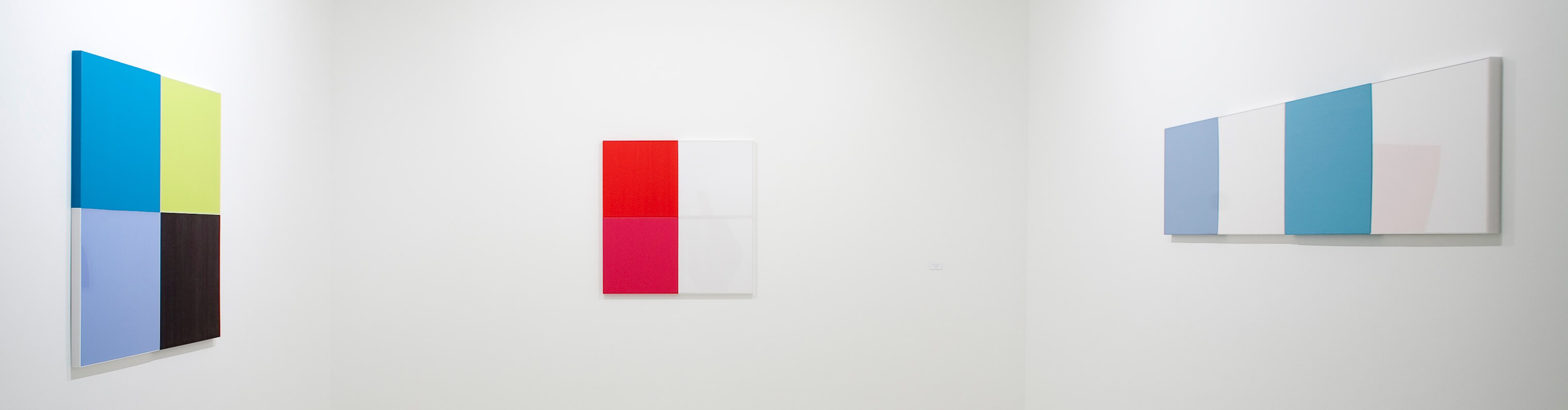
Starting in 2005, Renata Tassinari has been leading her painting in the direction of growing impersonality. The areas of color have become even more regular, the handiwork has nearly disappeared, the colors have broadened their spectrum — in the past Renata had a much more characteristic palette — and some materials (acrylic and wood sheets) began to be included in the works with a status similar to that of painted surfaces. The inclusion of elements from the world — wood, etc. — could have given the pictures a greater concreteness, somewhat removed from the more optical dimension of color surfaces. However, the works' final appearance seems ambiguous, oscillating between the artificiality of kitchen cabinets and the subtleties of Venetian Renaissance painting, between the unthinking blatancy of the saturated tones of an internet page and the complex equilibrium obtained through extreme familiarity with colors and how to dispose them on a surface.
In several of the works completed in recent years the artist uses acrylic sheets painted from behind. In those areas of the pictures, the observer feels placed in a paradoxical position, which in my view synthesizes in an exemplary manner the paradoxes and dilemmas that Renata Tassinari incorporated into her painting and that reveal the importance of the issues that have always guided her. Because their backs are covered with color, the acrylic sheets become even more reflective of light. When facing them, the observer's attention is drawn by the gloss which they emit, which seems to point both to a radical intensity of color and to its impossibility, since the colors themselves are stifled by a thick layer of matter — transparent matter, no doubt, but one that deadens the colors' ability to affect our sensibility.
And I am convinced that this characteristic of certain areas of her painting ends up impregnating even those regions where color shows itself directly, where the artist paints on other surfaces (acrylic or otherwise), further provoking our senses and our desire to connect with something less flighty and ambiguous. And, in this play, the very intensity of the phenomena ultimately points to the artificiality of their condition more than to any capacity to point towards reality and its significance. Standing before these paintings, we experience, at the same time, some of the vivacity characteristic of natural colors — the green of the leaves of a tree, for example — plus the attractive neutrality of a Coca-Cola ad. And, in vain, we struggle to unify two phenomena that, for now, still seem to possess incompatible natures. This may be uncomfortable, but it is remarkably reminiscent of the life we lead.
PUBLISHED IN RENATA TASSINARI . RIO DE JANEIRO, 2009 : FRANCISCO ALVES