1998
Lorenzo Mammi
Galeria Valú Oria
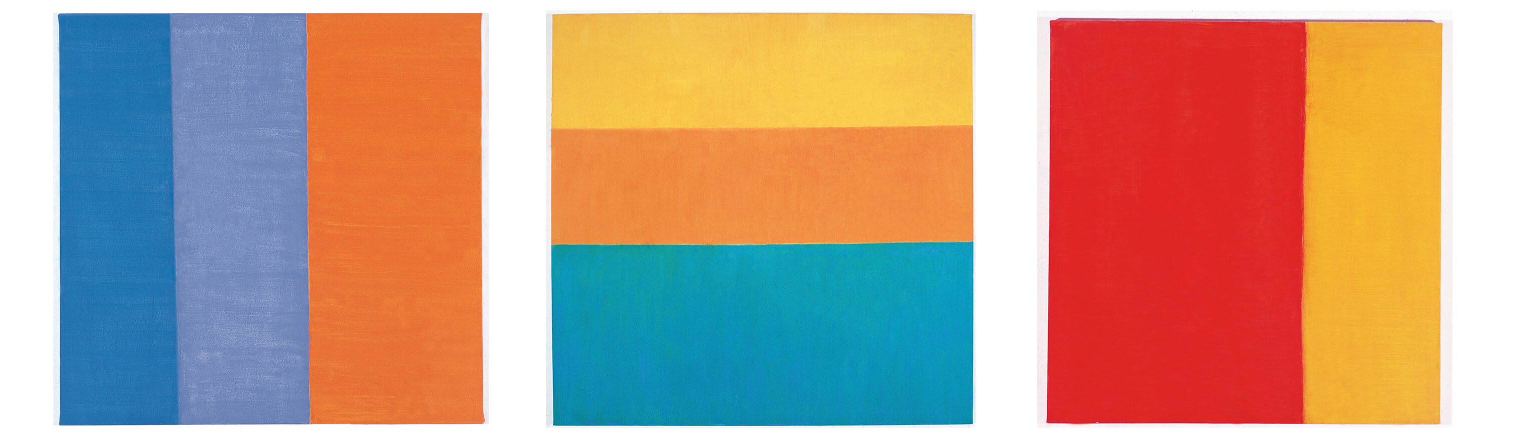
In her first works, Renata Tassinari´s color descended directly from that of Matisse: each hue was self-suficient with autonomous and independent value, and at the same time enhanced the autonomy of neighboring hues instead of flattering them. It was an art without shadows, where colors became more luminous as they juxtaposed on the canvas. The cardboard pieces and other materials that the artist put on the canvas below the layers of paint didn´t interfere in the luminous quality of the work. Conversely, they confirmed their nonchalant character and their independence regarding the uneven surface of the canvas. In those works color was something instantaneous and easy to feel.
Little by little, Renata´s canvases began to allow darker regions - light, still triumphant in some areas of the painting, was fading in others. On the other hand, golden strips of color began to appear as light flashes, contrasting with the darker areas. The shine of the gold, however, is not a bright light emerging from the canvas, but rather a reflection of the light that comes from the outside. Thus, a range of colors was created - the more opaque areas, optically more subtle, solid color areas matching the spatial plane and shining areas whose peak intensity point was on the surface of the painting and not inside it. This ideal differentiation of the planes corresponded to a shrinking of the color field diagram that is now organized in a more simple way by means of strips or large rectangles in irregular rhythm that reminds Sued´s paintings. Sued, however, works in series, by means of successive color fields where all colors have equal power and each one could in theory replace any other color. Conversely, Renata Tassinari, accepts areas of similar hues - moments of plenitude beside regions that are restrained to the field or go beyond it.
As últimas obras me parecem marcar outra fase no trabalho do artista. As diferentes gradações de cor não mais se contrapõem entre si, mas, de uma certa maneira, deságuam uma na outra, como diferentes momentos de um processo. Antes de aparecer nas telas, essa mudança tornou-se evidente nos desenhos. Nos trabalhos sobre papel, onde o suporte se imbui da tinta, criando um halo em volta da área colorida, a cor emerge progressivamente. Ela não está numa determinada situação de luz. Ela vem à luz. Nesse contexto, os toques de ouro já não são elementos de contraste, mas ápices numa intensificação progressiva. Lembram as lumeggiature, os pingos de ouro que, nas miniaturas, marcam os pontos mais expostos à luz das figuras.
The latest works seem to indicate a new phase in her carreer. Different ranges of color do not oppose, but in a certain way flow into one another like different stages of a process. Before being seen on the canvases, this change became clear on the drawings. On the paper works, where the support impregnates the paint creating a halo around the colored area, color emerges progressively. It is perceived but not due to the light. Actually, it comes towards the light. In this context, the gold touches are not a contrast element anymore, but highlights in progressive intensification. They evoke lumeggiature - golden drops that used to mark the points on the miniatures - and are more exposed to the light of the figures.
In her paintings the transition from the least to the top intensity of color is determined by a fluid relation between colors. Color now comes from way below the surface paint, where a layer with another color is invisible when the work is completed, but determines the quality of the visible layer. In other words, the background color is not totally hidden - it is visible in subtle cracks in the transition between color strips. These strips have become less geometrically exact like in her previous works: they have pliant outlines that express the uncertainty of the artist´s drawing hands. If the prior phase of the artist reminds that of Sued´s, her work now evokes Volpi´s art. The artist is more concerned about making evident the workmanship character of the color and therefore the process itself and its history.
Some of Renata Tassinari´s recent works use the white color as the brightest area for the first time. Two different values of white differ just by the direction of the brushstrokes. White, as well known, is the sum of all colors that are translucent to light (when colors only reflect light, their sum is black). This comment, however, is neither mathematical nor ideal – although the same white spot is used on different canvases it never looks the same. On the contrary, it is determined by the color strip that constrains the white, and from where it seems to come. The white color that comes from the orange is differente from the white color that comes from the blue color, not by hue in itself, but by its history. Nevertheless, the passage to white never carries a dramatic intensification, but a sedimentation or purification by the handling. A placid transition that suggests a patient familiarity.